ㅤ
Companion Website for "3D reconstruction of skin and spatial mapping of immune cell density, vascular distance and effects of sun exposure and aging"
Soumya Ghose1,2, Yingnan Ju1,3, Elizabeth McDonough2,Jonhan Ho4, Arivarasan Karunamurthy4, Chrystal Chadwick2, Sanghee Cho2, Rachel Rose2, Alex Corwin2, Eric Williams2, Christine Surrette2, Jessica Martinez2, Anup Sood2, Yousef Al-Kofahi2, Louis Falo4, Katy Börner3,5, Fiona Ginty2,5
1Joint first-authors; 5Joint corresponding authors
2 GE Research Center; 3 Indiana University; 4 University of Pittsburgh
Link to MATRICS-A code on GitHub
Link to Data Collection on HuBMAP Portal
DOIs for Data:
- Region 1: 10.35079/HBM732.FZVZ.656,https://doi.org/10.35079/HBM732.FZVZ.656
- Region 2: 10.35079/HBM747.SPWK.779, https://doi.org/10.35079/HBM747.SPWK.779
- Region 3: 10.35079/HBM398.NCVN.256,https://doi.org/10.35079/HBM398.NCVN.256
- Region 4: 10.35079/HBM746.VTDZ.959,https://doi.org/10.35079/HBM746.VTDZ.959
- Region 5: 10.35079/HBM875.SBHJ.939,https://doi.org/10.35079/HBM875.SBHJ.939
- Region 6: 10.35079/HBM867.NMXL.794, https://doi.org/10.35079/HBM867.NMXL.794
- Region 7: 10.35079/HBM666.JCGS.862,https://doi.org/10.35079/HBM666.JCGS.862
- Region 8: 10.35079/HBM592.JGSQ.253,https://doi.org/10.35079/HBM592.JGSQ.253
- Region 9: 10.35079/HBM494.XDQW.356, https://doi.org/10.35079/HBM494.XDQW.356
- Region 10: 10.35079/HBM238.ZKPC.934,https://doi.org/10.35079/HBM238.ZKPC.934
- Region 11: 10.35079/HBM975.FVCG.922, https://doi.org/10.35079/HBM975.FVCG.922
- Region 12: 10.35079/HBM674.XQFQ.364, https://doi.org/10.35079/HBM674.XQFQ.364
Explore Skin Tissue Data in 2D
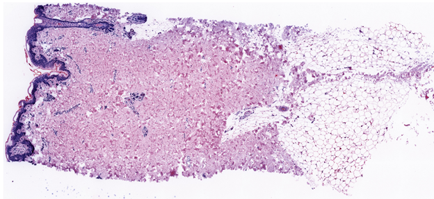
Virtual H&E (pseudo colored DAPI and autofluorescence image) for all regions. Region 10 shown below. Each 3D view has a link to a single virtual H&E image for reference.
Images are also accessible at Virtual H&E Images of 12 regions
Explore Skin Tissue Data in 3D
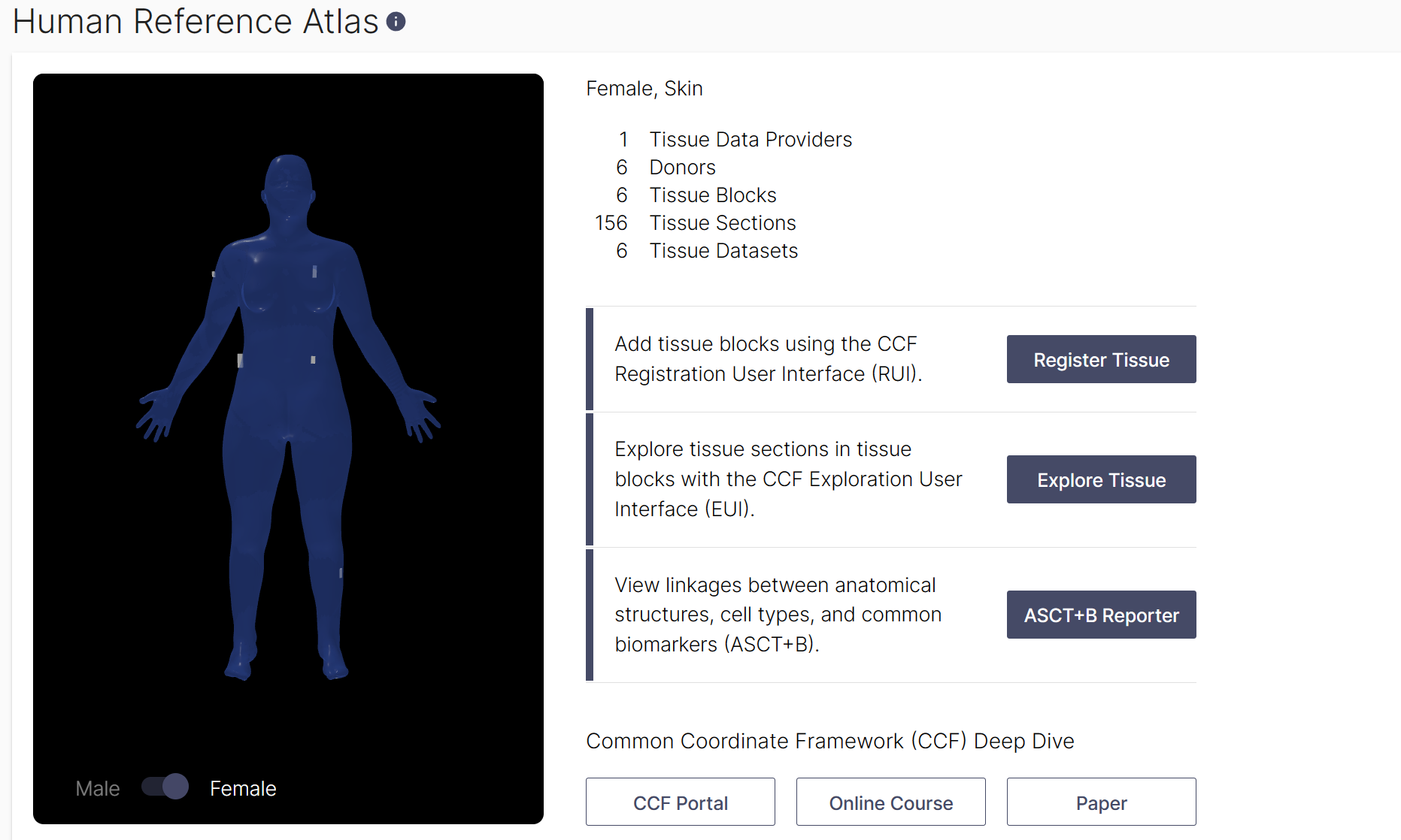
All tissue datasets used in this study can be explored in their three-dimensional size, position, and rotation in the context of the Human Reference Atlas. In total, 12 data sets were collected and 10 were used in the final analysis (2 were excluded due to presence of a benign cyst (region 6) and scarring (region 12). For the final 10 datasets that were analyzed, six were collected from male donors, and four were collected from female donors. Using the Exploration User Interface (EUI), you can:
- Select an organ: one can navigate available organs by selecting them from the carousel above the stage or using the ontology on the left. Select ‘Skin’ to see all skin datasets on stage.
- Filter: above the Search is the Filter icon which opens a menu with many options (e.g., sex, assay types, etc.) for refining what tissue data is presented. Under Tissue Providers, select ‘RTI-General Electric’ to see 312 tissue sections from 12 donors listed on right. Click on one of the 12 tissue blocks listed to see all tissue sections cut from it.
- Registered Blocks: it is possible to select a block of tissue samples either using the bodies on stage or the cards in the right column. Color coding helps to identify different selections. Select tissue block on the male head to see age, BMI and to explore the 28 tissue sections cut from it.
- Data : using the cards in the right column, click on items to dig deeper into the data. You can watch a tutorial on how to use the EUI here.
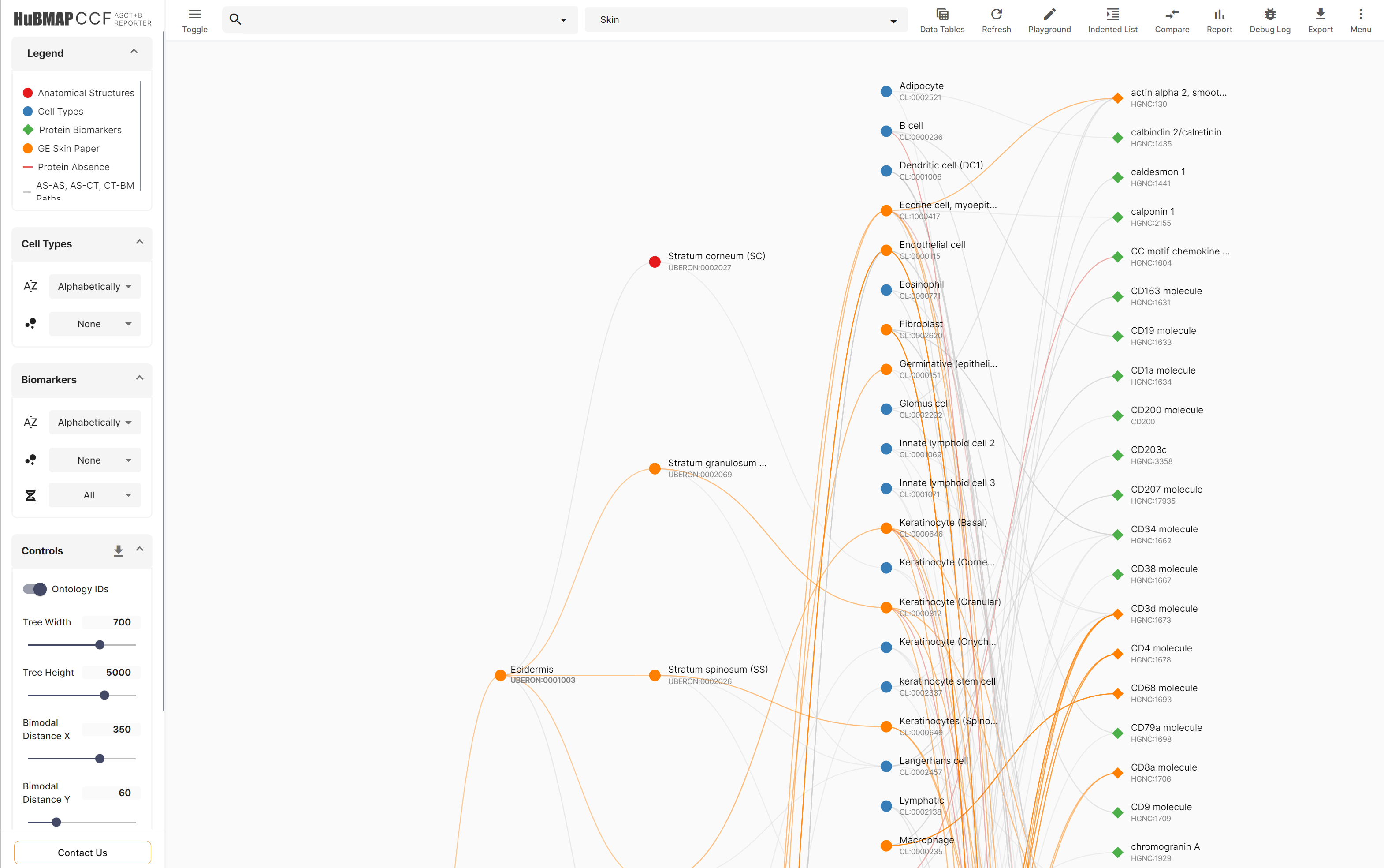
Skin Anatomical Structures, Cell Types and Biomarker (ASCT+B) Table and Comparison
In support of CCF design, ASCT+B table was compiled for all organs under investigation in HuBMAP, see details for ASCT+B table effort here. A subset of these anatomical structures (AS), cell types (CT) and biomarkers (B) were included in this paper. TheASCT+B Reporter was used to comparethe AS, CT and B used in this paper to the most recent version (1.2) of the skin ASCT+B aster table.
Link to skin master ASCT+B Table: Anatomical Structures, Cell Types, plus Biomarkers (ASCT+B) table for skin v1.2
Link to experimental skin ASCT+B Metadata: Skin markers used in the paper
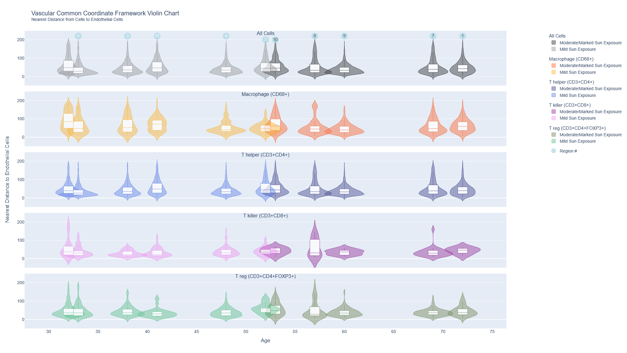
Violin Charts for Immune Cells
These interactive violin plots show the distribution of distances of immune cells (T Helper, T Killer, T reg, macrophages) to the nearest endothelial cell in all regions and plotted by sun exposure (mild/marked) and age for all 10 donors.
Link to violin plots for immune cell distances from endothelial cells
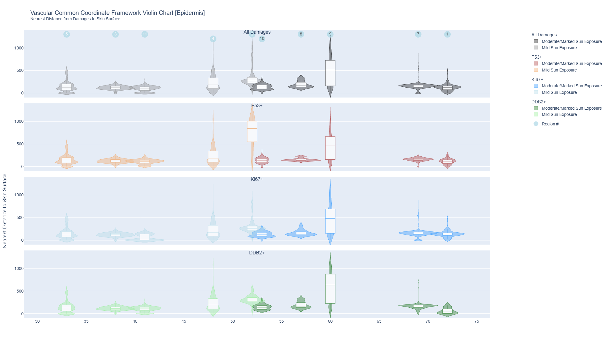
Violin Charts for Epidermis Cells
The interactive violin plots combine a box plot and a density plot to display the probability density of keratinocyte cells positive for markers of DNA damage (p53), repair (DBB2) damage and proliferation (Ki67) and distance from the skin surface. They were plotted by sun exposure (mild/marked) and age for all 10 donors.
AE1 positive keratinocytes
The interactive violin plots combine a box plot and a density plot to display the probability density of keratinocyte cells (detected by cytokeratin AE1) positive for markers of DNA damage (p53), repair (DBB2) damage and proliferation (Ki67) and distance from the skin surface. They were grouped by sun exposure and plotted by age for all 10 donors.
CK26 positive keratinocytes

Vascular Common Coordinate Framework Visualization - Immune Cell Distance to Endothelial Cells
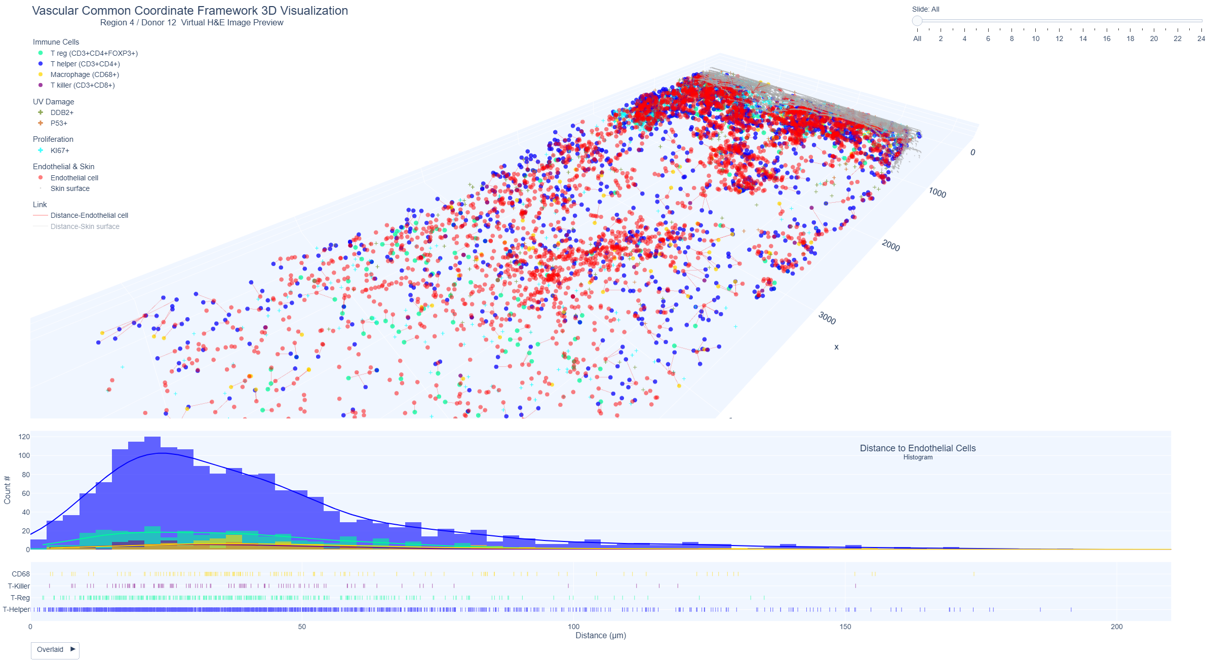
These interactive plots show the 3D view of the skin and the distribution of immune cells (T helper, T killer, T reg, macrophages) and distance to nearest endothelial cells.
External link to the 3D view for immune cells:
Region 1 / Region 2 / Region 3 / Region 4 / Region 5 /
Region 7 / Region 8 / Region 9 / Region 10 / Region 11
Example Region 4: Immune cells (T helper, T killer, T reg, macrophages) and distance to nearest endothelial cell
3D distance between immune cells and nearest endothelial cells for region 4 (donor 12, male, 48 years, superior abdomen, mild sun exposure); (ii) and histogram plots showing the highest distribution of immune cells within 50-200 um and higher counts of T killer cells within 50 um
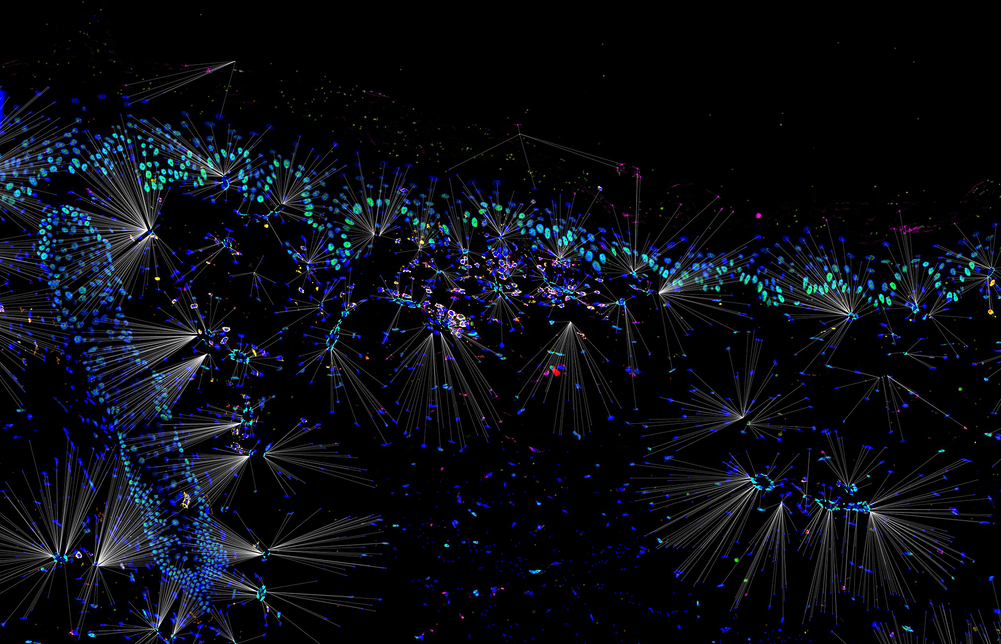
Example Region 11: Immune cells (T helper, T killer, T reg, macrophages) and distance to nearest endothelial cell (RGB rendered version)
Vascular Common Coordinate Framework Visualization - Epithelial Cells
These interactive plots show the 3D view of the skin and the distribution of p53, DDB2 and Ki67 positive keratinocytes and distance to the skin surface.
External link to the 3D view for epithelial cells:
Region 1 / Region 2 / Region 3 / Region 4 / Region 5 /
Region 7 / Region 8 / Region 9 / Region 10 / Region 11
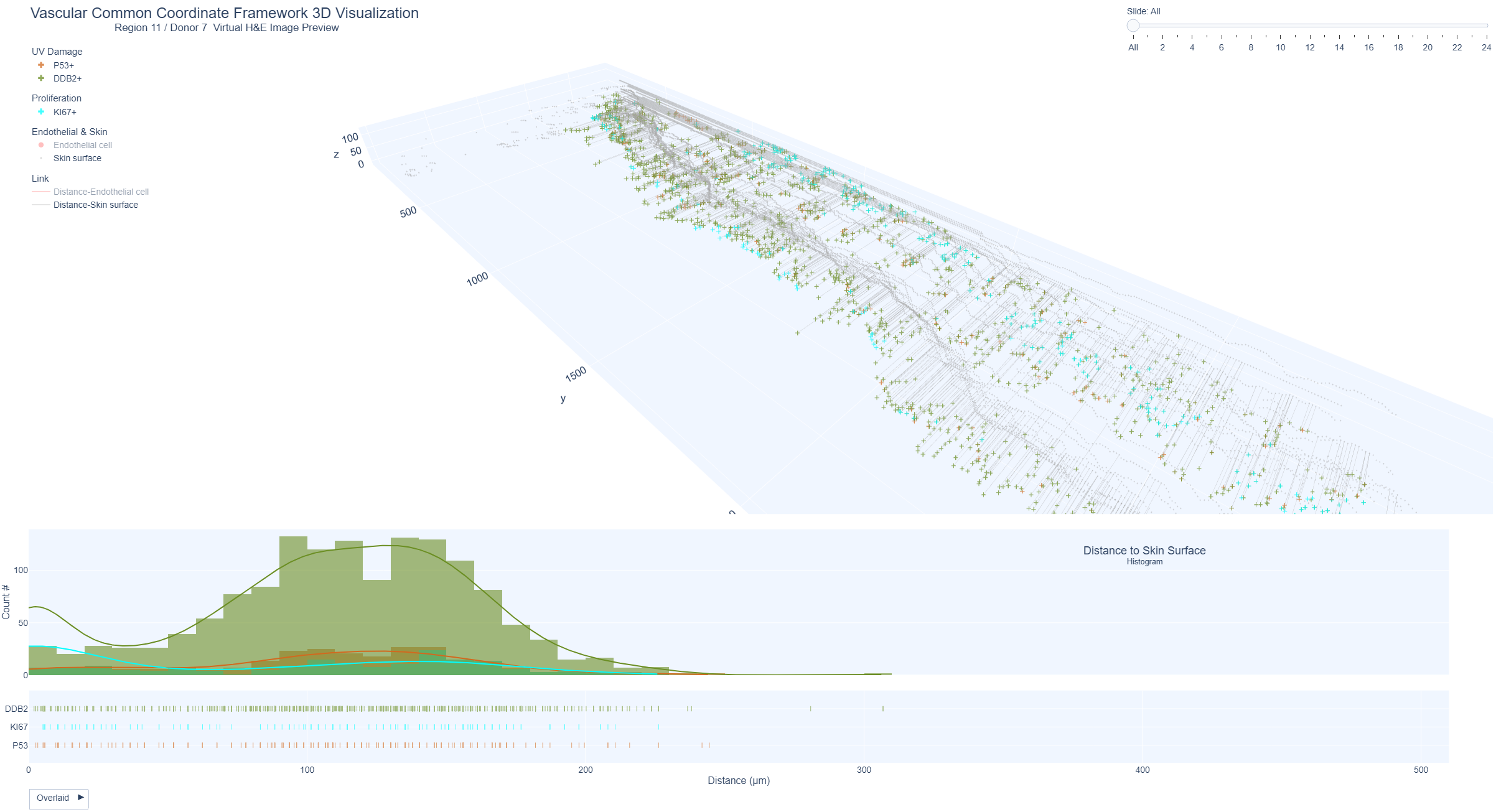
Example Region 11: Keratinocytes positive for markers of UV damage (p53), repair (DDB2) and proliferation (Ki67) and distance from skin surface
Markers of UV damage, repair and proliferation in epidermis and distance to skin surface represented as 3D distance plots from the skin surface and histogram distribution. Region 11 (upper arm, mild sun exposure, 41 years) shows a higher distribution of DDB2 positive keratinocytes within 200 um distance from the skin surface and lower distribution of keratinocytes positive for p53 and Ki67
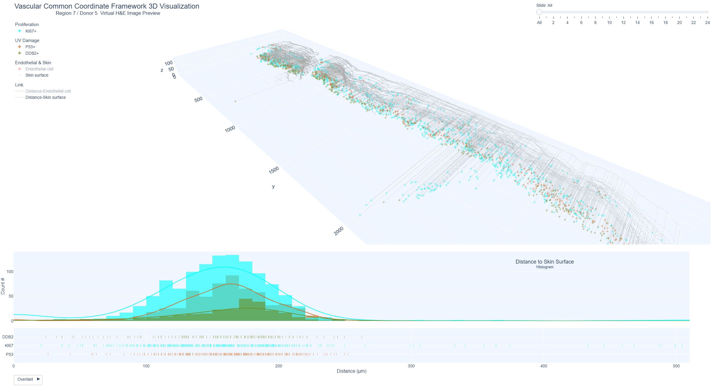
Example Region 7: Keratinocytes positive for markers of UV damage (p53), repair (DDB2) and proliferation (Ki67) and distance from skin surface
Positive keratinocytes were shown as 3D distance plots from the skin surface and histogram distribution. Region 7 (lower forearm, marked sun exposure, 69 years) shows highest distribution of Ki67 positive keratinocytes within 200 µm distance from the skin surface, followed by p53 and lowest DDB2 positive keratinocytes.
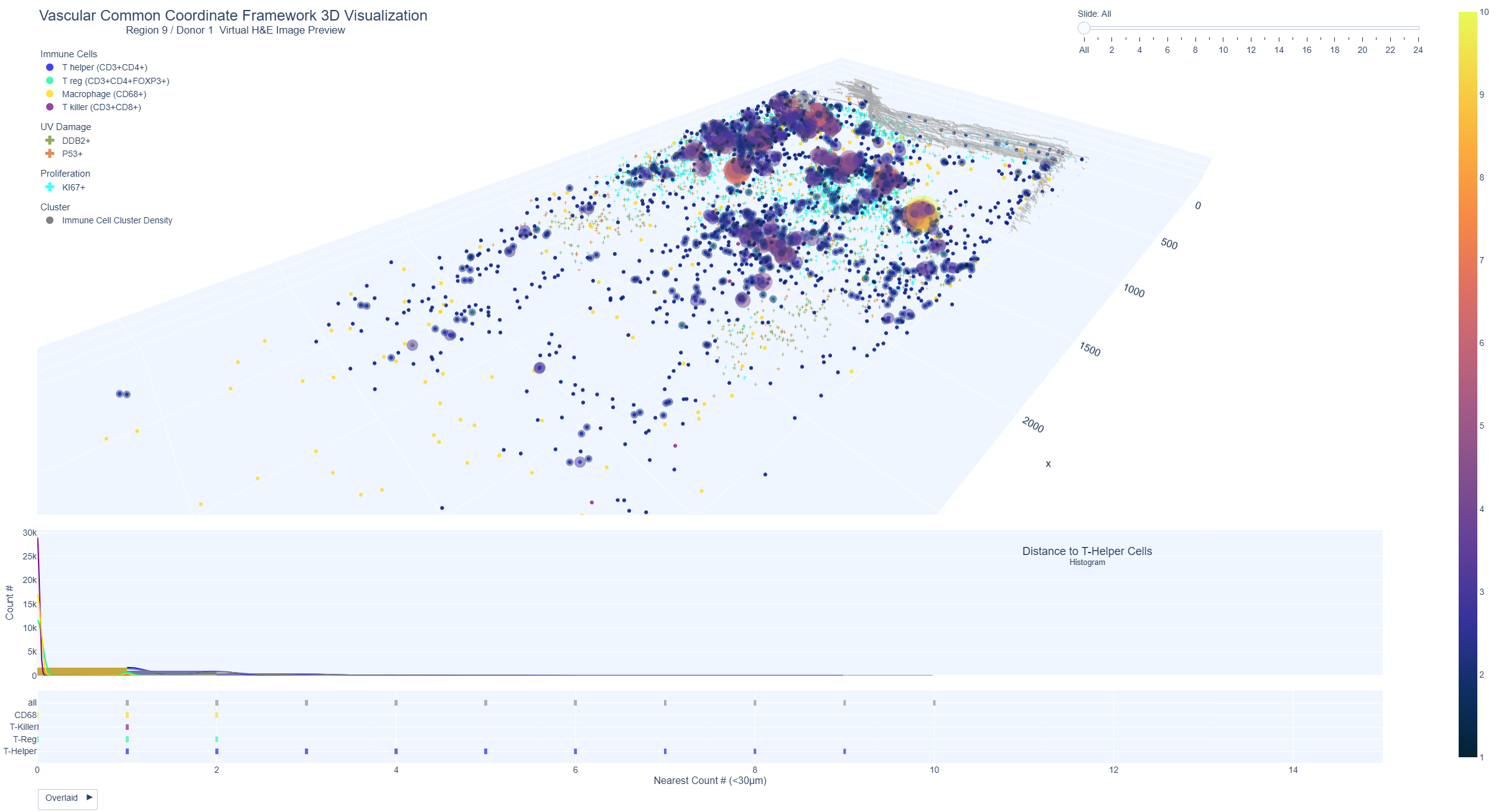
Vascular Common Coordinate Framework Visualization - Immune Cell Cluster Density
These interactive plots show the 3D view of the distribution and clustering of immune cells (T cells). The immune cell cluster view allows for the identification of areas with high immune cell density through the use of heatmap-like bubbles of varying sizes and colors. Large, yellow bubbles indicate a high density of immune cells, while small, dark blue bubbles indicate a lower density.
External link to the 3D view for the immune cells clustering views:
Region 1 / Region 2 / Region 3 / Region 4 / Region 5 /
Region 7 / Region 8 / Region 9 / Region 10 / Region 11
Example Region 9: Medium-high immune cluster density plot from region 9 (donor 1, male aged 60 years, sample was from the lower distal arm region, with marked sun exposure).
Statistical comparison between 2D and 3D immune cell counts
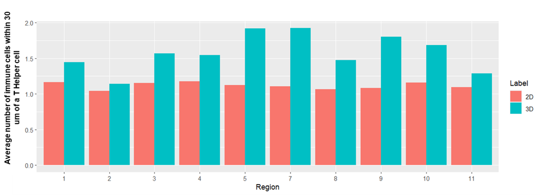
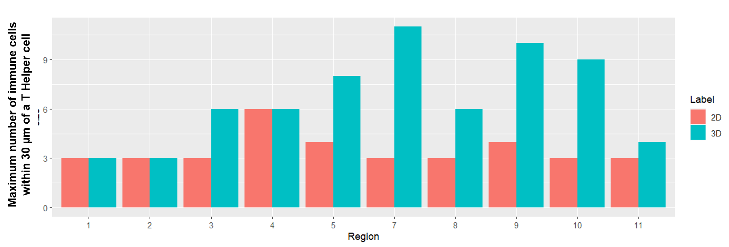
(A) Average number of all T cells within 30 µm of a T helper cell in 2D (red) and 3D (blue) for each region. Overall, the number of immune cells within 30 µm of a T helper cell was higher in 3D compared to 2D with 10-70% more cells found in 3D; (B) Maximum number of immune cells within 30 μm of a T helper cell. There was variation across all regions, for example, in region 7 there was a cluster of 11 immune cells within 30 μm in 3D while just 3 cells were quantified in 2D.
(A)
(B)
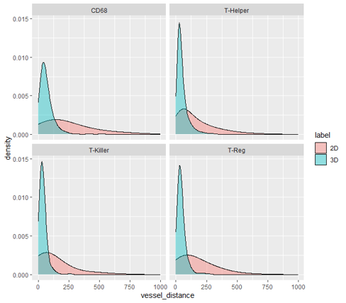
Histogram of distance of immune cells (CD68, T helper, T killer, and T reg) to nearest endothelial cell. 3D distance tends to be much shorter (distance was capped at 1000 µm for visualization). The average distance of the nearest endothelial cell to immune cells in 3D was approximately half that found in 2D (~56 µm vs 108 µm on average). Two sample Kolmogorov-Smirnov test was performed to confirm that there is statistically significant difference between the 2D and 3D distributions for total immune cell counts (D =0.43, p-value <2.2e-16).
Skin 3D Models
The CCF 3D Reference Object Library provides anatomically correct reference organs. The organs are developed by a specialist in 3D medical illustration and approved by organ experts.
Initially, reference objects are created using data from the Visible Human male and female datasets provided by the National Library of Medicine. The male dataset comprises 1,871 cross-sections at 1mm intervals for both CT and anatomical images at a resolution of 4,096 pixels by 2,700 pixels. The female data set has the same characteristics as the Visible Human Male but axial anatomical images were obtained at 0.33 mm intervals resulting in 5,189 cross-section anatomical images. The male was white, 180.3 cm (71 inch) tall, 199-pound and was 38 years old. The female was white, 171.2 cm (67.4 inch) tall, obese, and 59 years old.
On March 12, 2022, a total of 50 reference organs–including the human skin–became available in GLB format. Each organ can be viewed and explored using free web browsers such as Babylon.js.
You can explore all the 3D models of the HRA at https://humanatlas.io/3d-reference-library
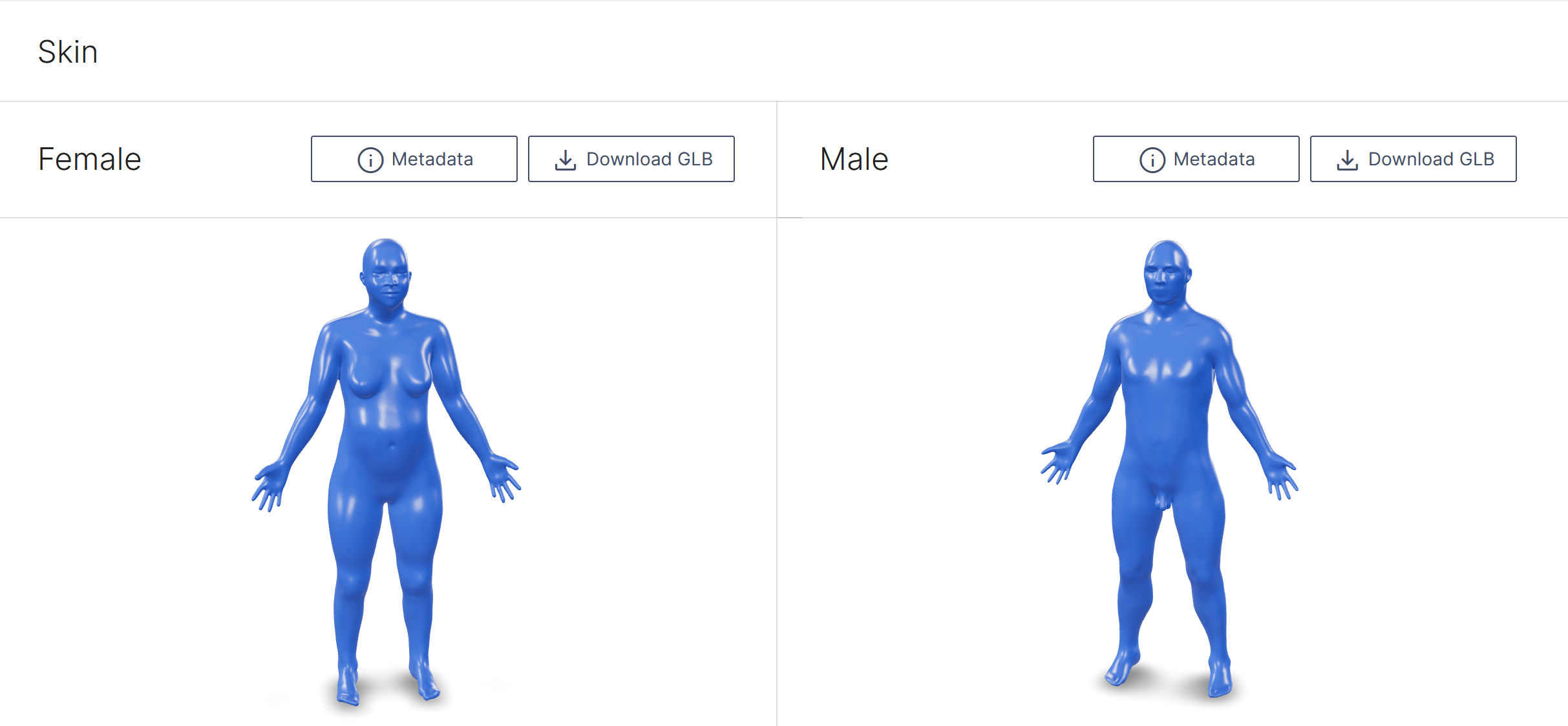
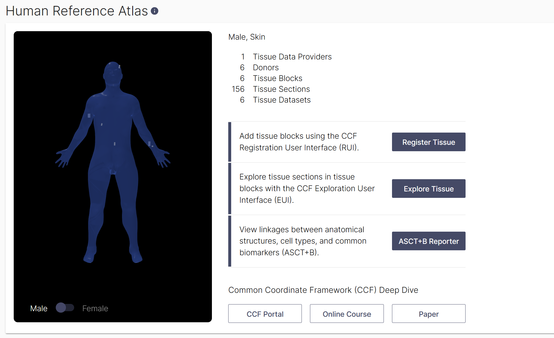
The Visible Human Project skin, female (left) and male (right)
Future work: Immune cells 3D mesh view
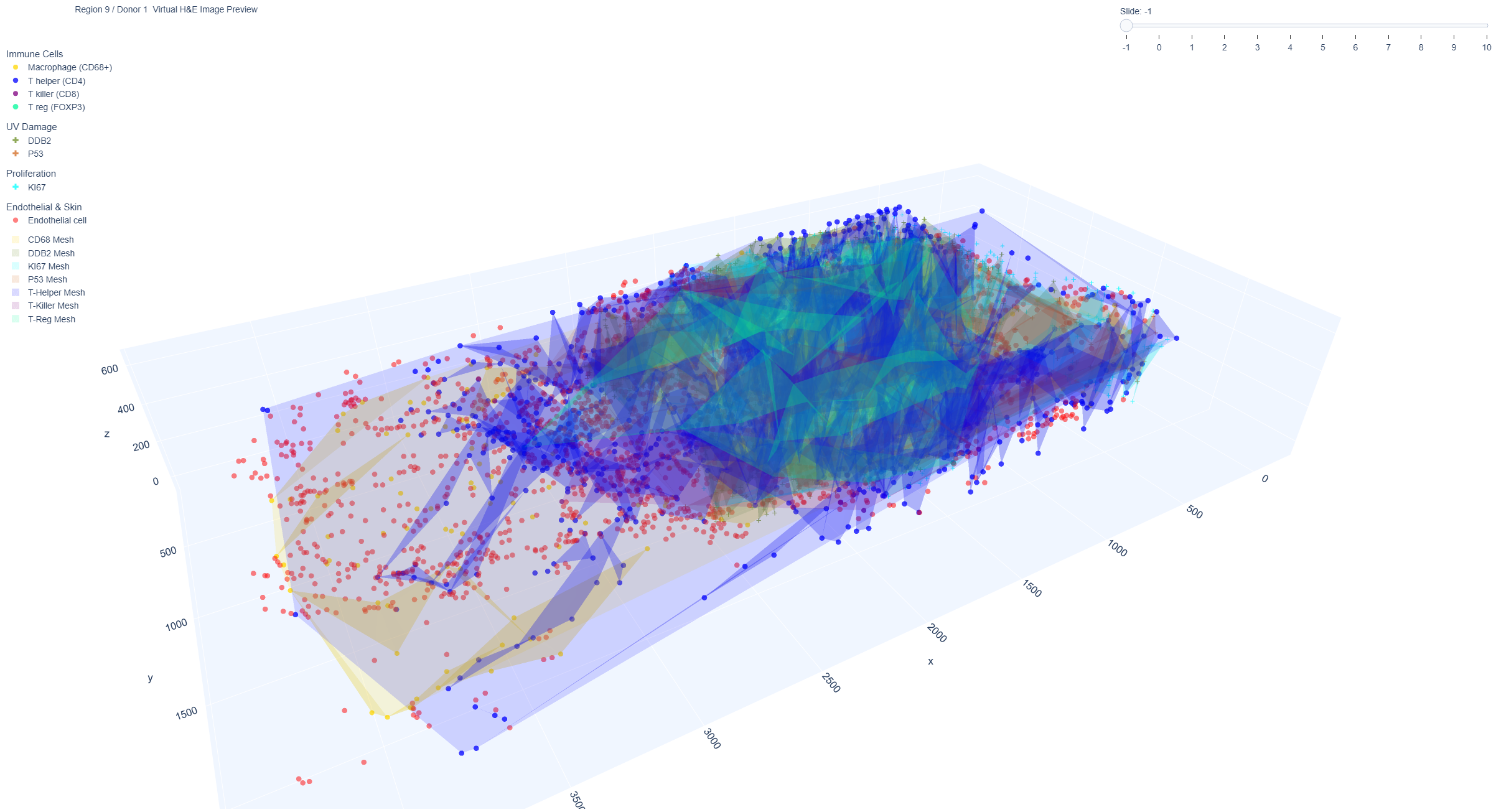
These interactive plots show the 3D representation of a set of triangles with vertices that outline the immune cells. This part is our future work and not included in the paper. These visualizations allow for the observation of the spatial distribution of immune cells within a skin sample through the use of 3D meshes and polygons. These distributions highlight the differences in both the spatial arrangements and overlap of various types of immune cells. The 3D meshes and polygons are created based on the spatial coordinates of the immune cells, and the shape of the mesh can also be influenced by the parameter alphahull.
External link to the 3D mesh view for the immune cells:
Region 1 / Region 2 / Region 3 / Region 4 / Region 5 /
Region 7 / Region 8 / Region 9 / Region 10 / Region 11
Example Region 9: 3D mesh view from region 9 (donor 1, male aged 60 years, sample was from the lower distal arm region, with marked sun exposure).
